VERTEX.
A PROP-TRADING LANDING PAGE THAT PUTS THE OFFER, PROOF, AND NEXT ACTION IN ONE FRAME.
- ROLE
- UX/UI DESIGNER
- CLIENT
- VERTEX
- PLATFORM
- WEB · RESPONSIVE
- SCOPE
- ACQUISITION · PRODUCT
- YEAR
- 2025
THE
BRIEF
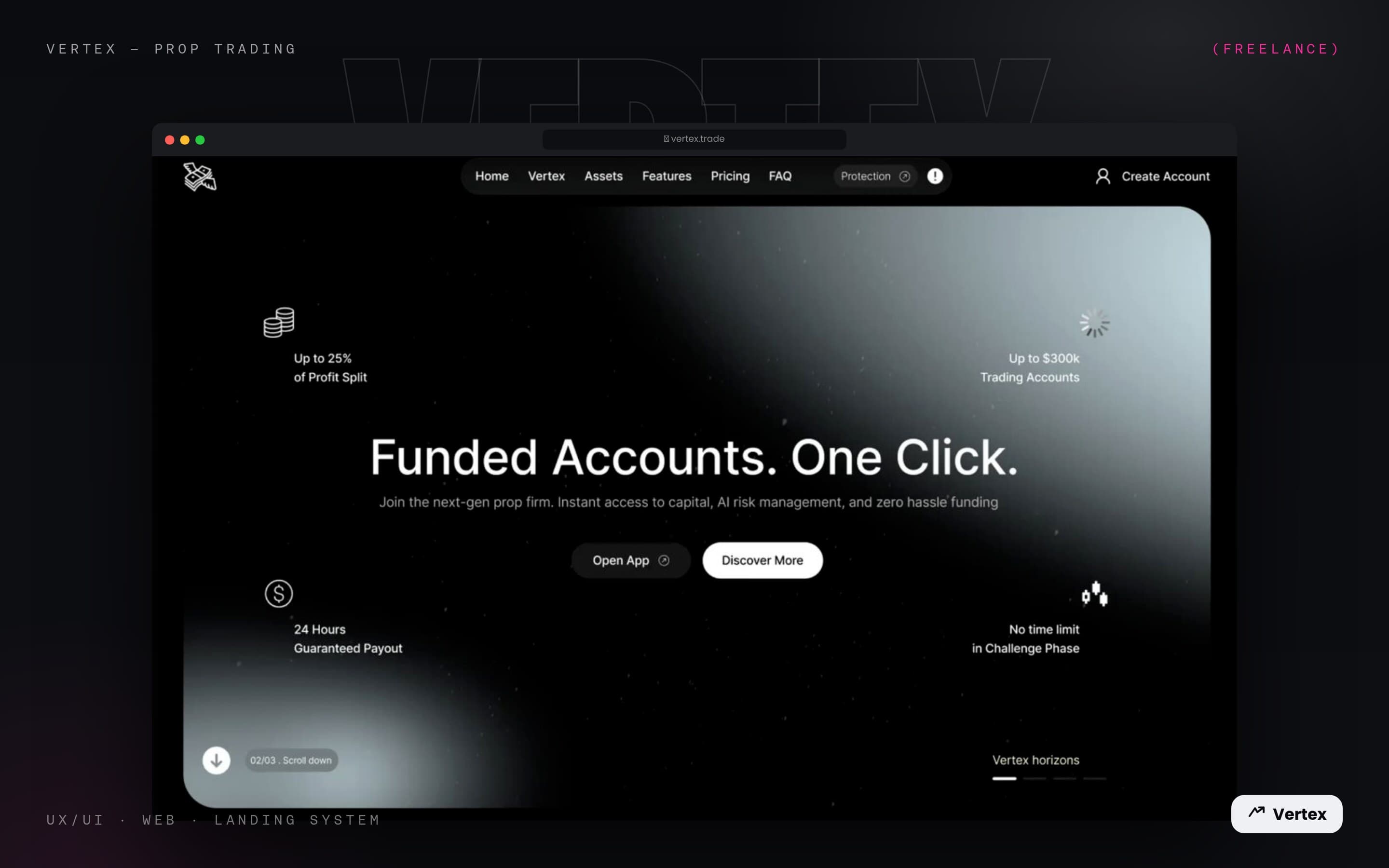
Vertex needed the prop-trading offer to feel immediate without becoming noisy. The landing page leads with one clear promise, then keeps the most persuasive benefits visible around it instead of burying them below the fold.
The result is a focused acquisition screen: funded accounts in one click, four concise proof points, direct product navigation, and two clear paths for traders who are ready to open the app or still need to learn more.
FUNDED ACCOUNTS. ONE CLICK.
ACQUISITION LANDING PAGE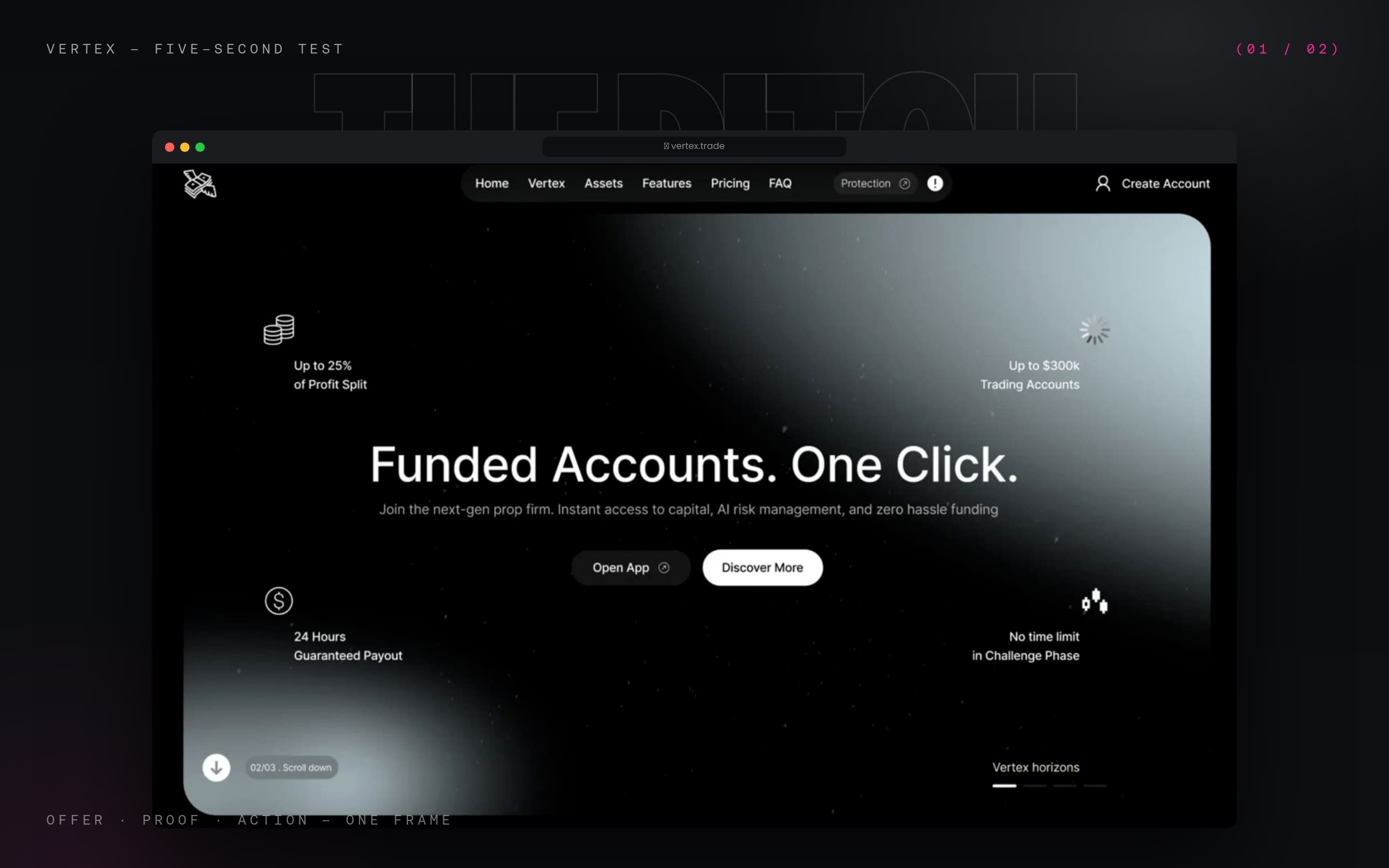
The central headline carries the whole proposition, while the supporting sentence explains capital access, AI risk management, and zero-hassle funding without competing for attention.
Open App and Discover More create a clean decision pair. The darker primary route feels product-led; the white secondary route gives cautious visitors a lower-commitment way to continue.
THE OFFER IN FRAME
BENEFITS & TRUST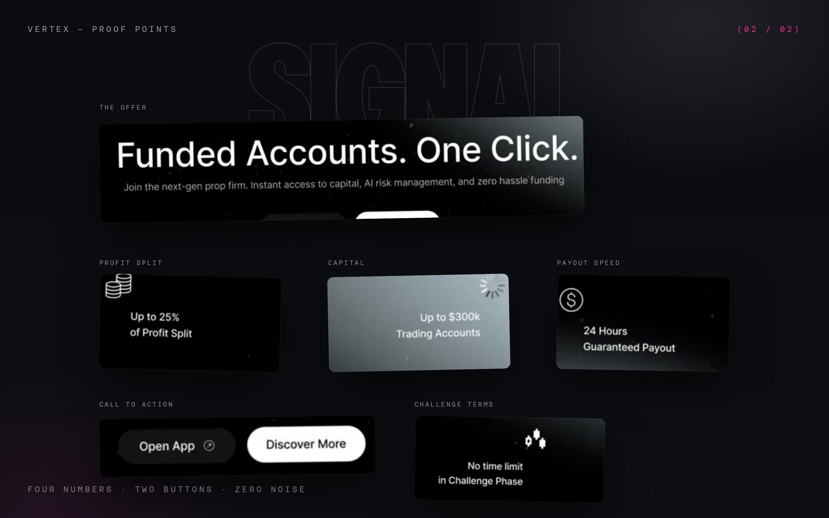
Profit split, account size, guaranteed payout, and the no-time-limit promise sit at the edges of the hero like a compact evidence layer. Each message stays short enough to scan without weakening the central statement.
A dark navigation capsule, protection status, account entry point, scroll cue, and horizon indicator make the screen feel like the opening frame of a larger product rather than a static campaign page.
THE OFFER
IS VISIBLE.
SO IS THE PATH.
THE LANDING PAGE HOLDS THE PROMISE, PROOF, AND NEXT ACTION IN A SINGLE COMPOSITION. THE RESULT FEELS PREMIUM, DIRECT, AND EASY TO UNDERSTAND BEFORE A TRADER MOVES DEEPER INTO THE PRODUCT.